'AVELLE' campaign concepts & marketing comms
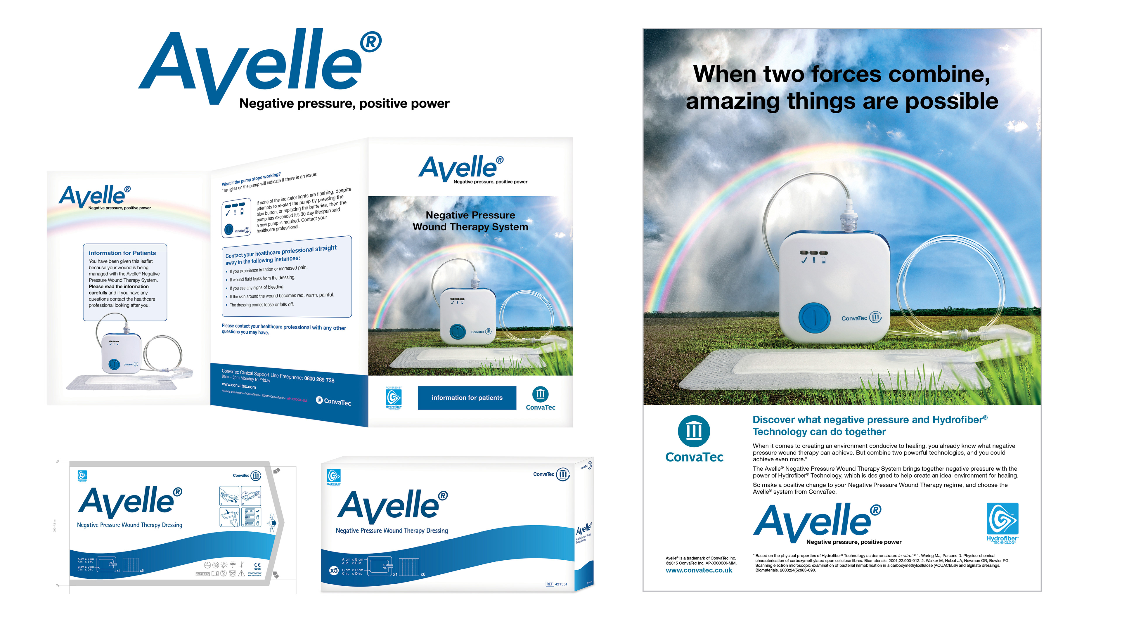
Global wound care specialists, Convatec, tasked me with creating the brand identity and accompanying concepts for the launch of their new product ‘Avelle’. ‘Avelle’ negative pressure wound therapy combines ‘negative pressure’ with the gelling power of ‘Hydrofiber Technology’ which creates the perfect environment for healing.
I began by creating a suite of campaignable concepts that communicated the two technologies combining to create this perfect healing outcome. The chosen concept “When two forces combine, amazing things can happen’ was then rolled out across, patient comms, packaging, exhibition stands and adverts.
'AQUACEL EXTRA' campaign concepts
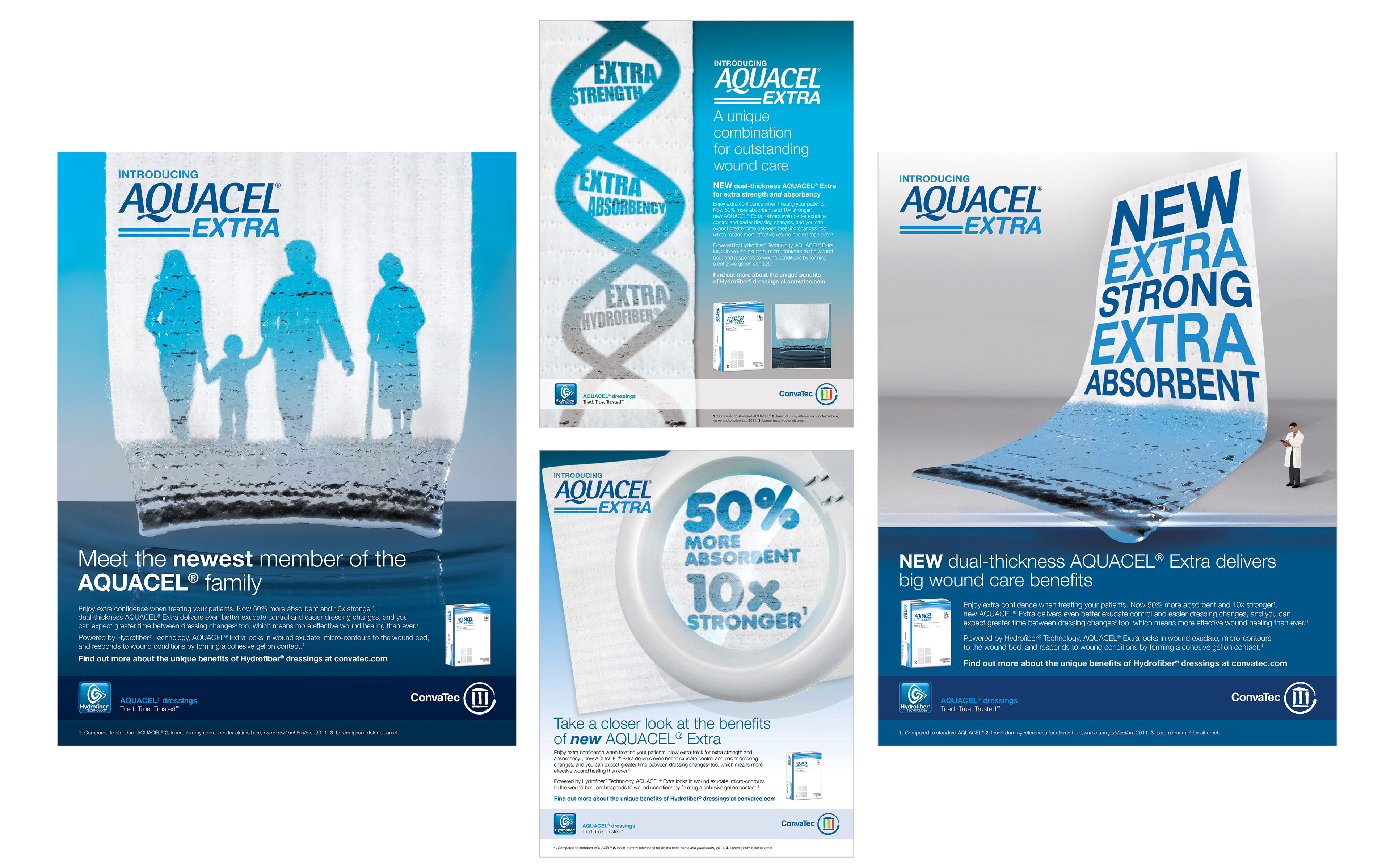
Convatec tasked us with developing a big idea for the launch of their new and improved wound care dressing ‘AQUACEL Extra’. The new dressing in the Aquacel family is powered by the gelling technology of ‘Hydrofiber’ and now delivers more absorbency and is stronger than its predecessor.
Convatec tasked us with developing a big idea for the launch of their new and improved wound care dressing ‘AQUACEL Extra’. The new dressing in the Aquacel family is powered by the gelling technology of ‘Hydrofiber’ and now delivers more absorbency and is stronger than its predecessor.
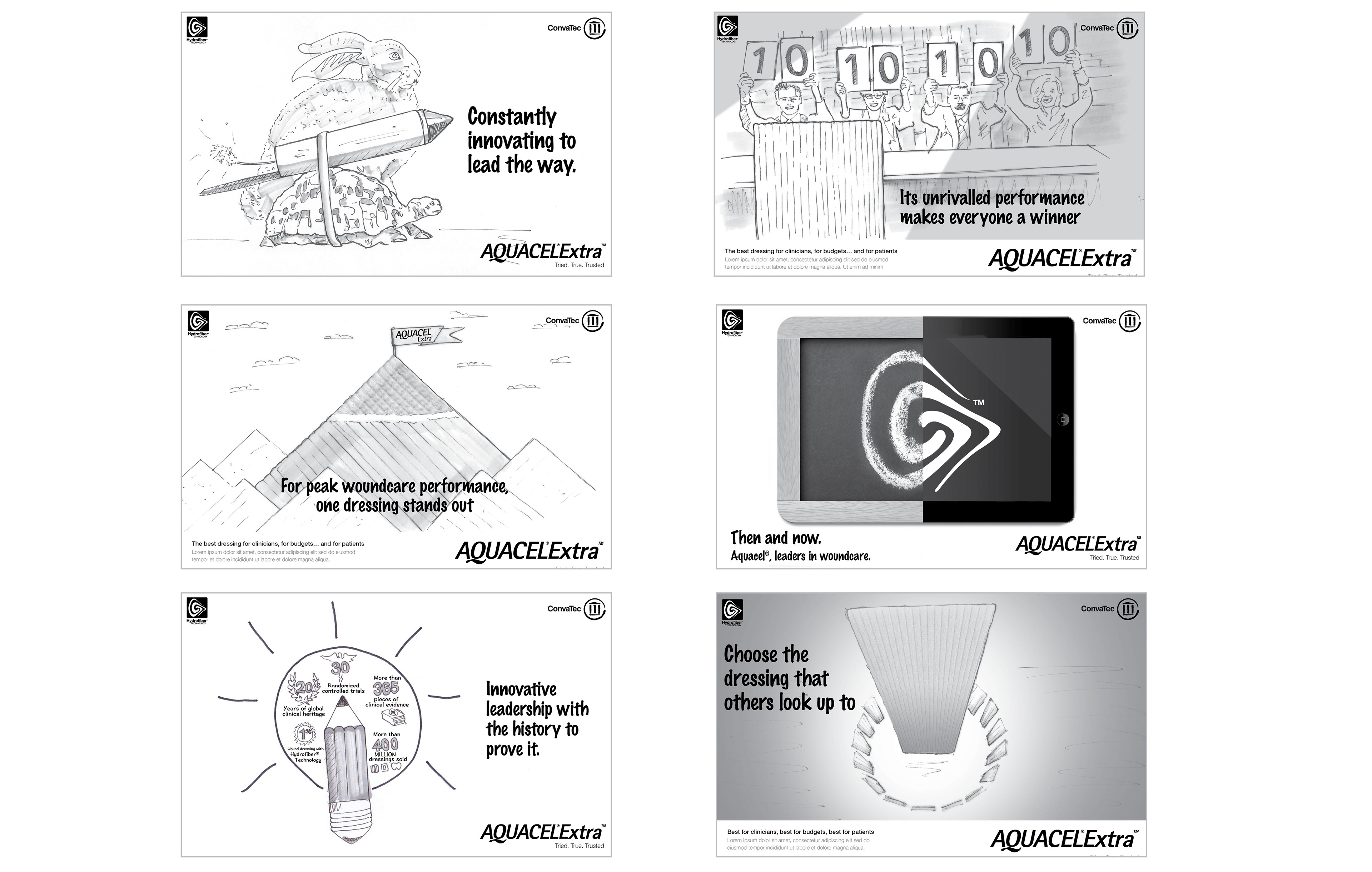
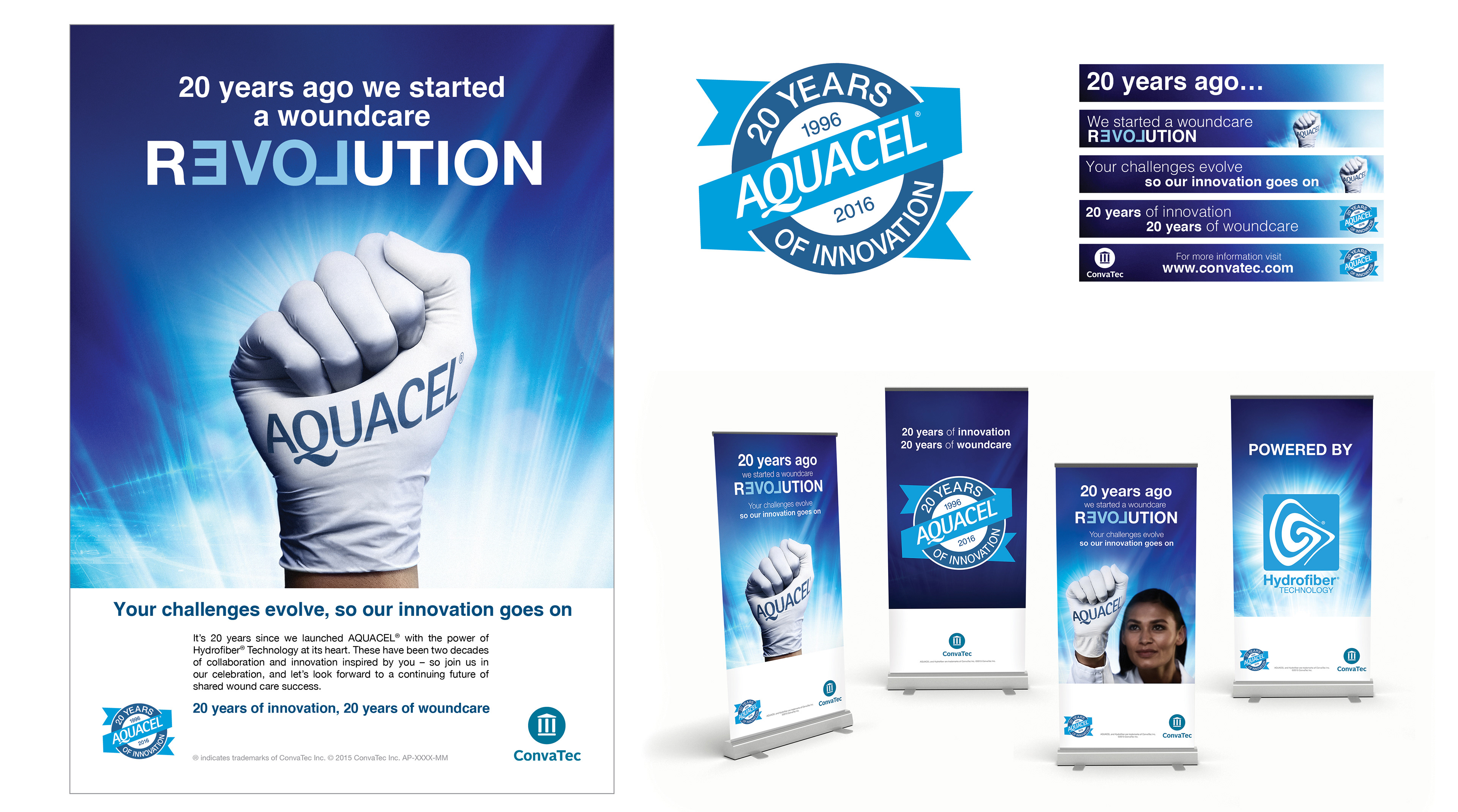
Convatec gave us the task of creating a campaign with many deliverables which celebrated their dominance in the global wound care market for the last 20 years.
The first step was to give the campaign it's own look and feel.
The first step was to give the campaign it's own look and feel.
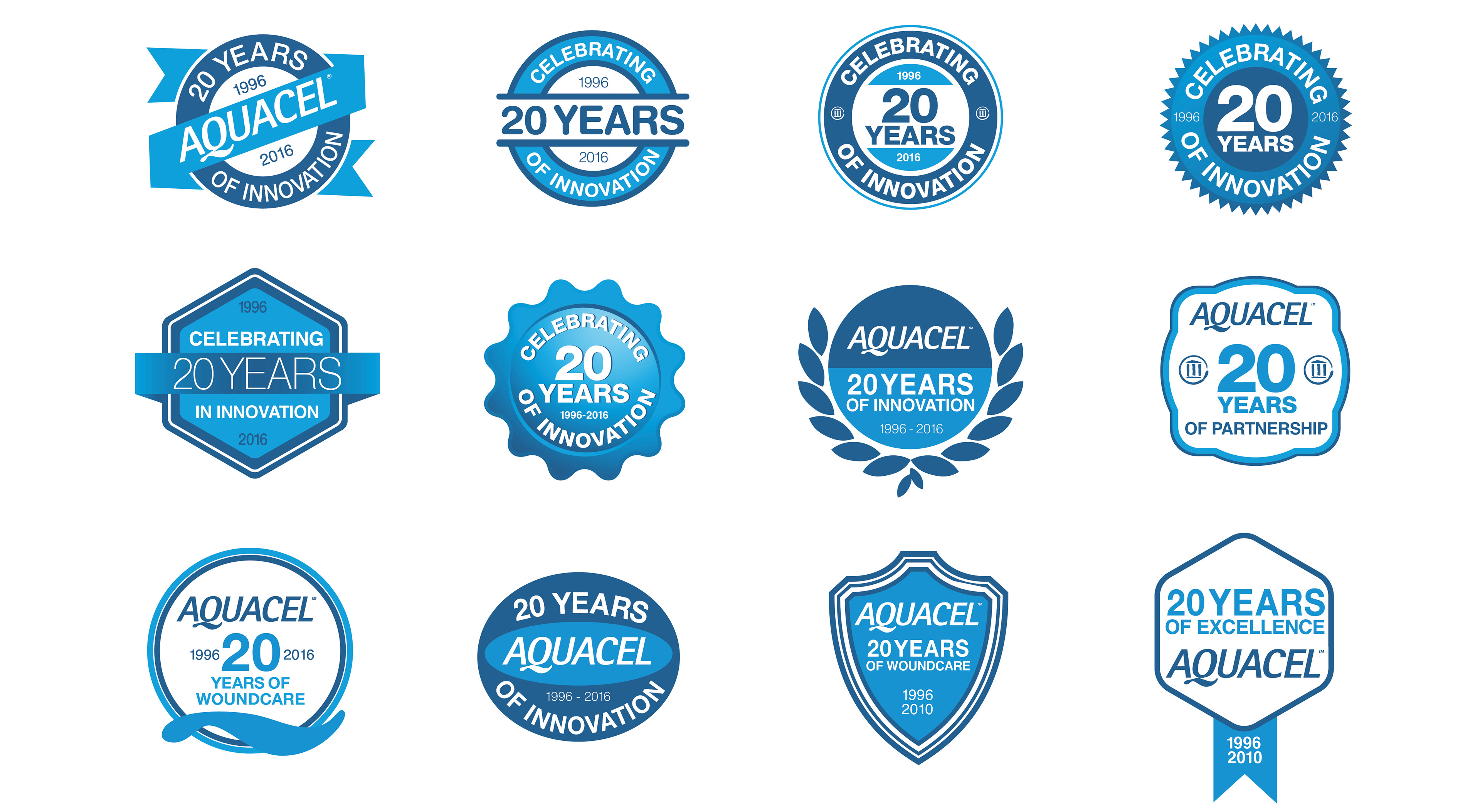
I began by creating a suite of concepts that communicated both their innovation and longevity. After they chose a winning concept, I began rolling the campaign out through many deliverables including campaign logo, global ads, brochures, online banners and exhibition materials.
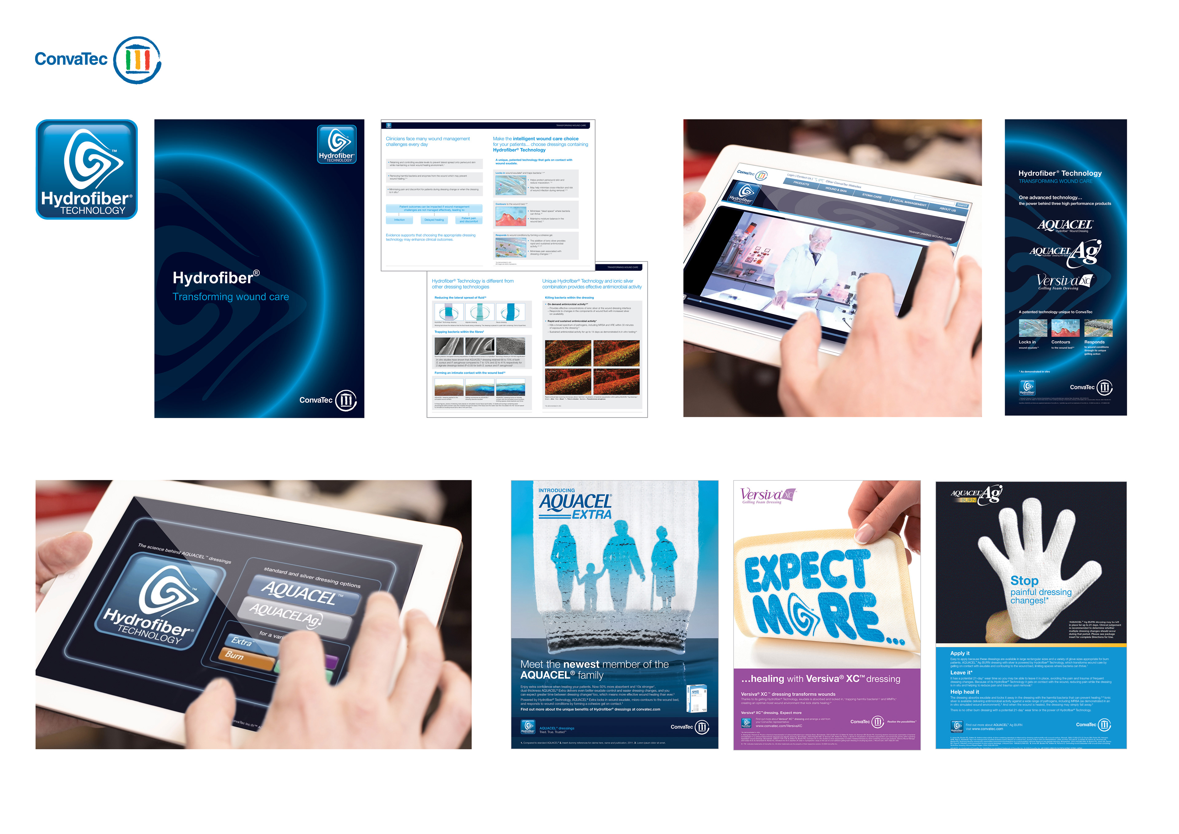
The Launch of Hydrofiber Technology
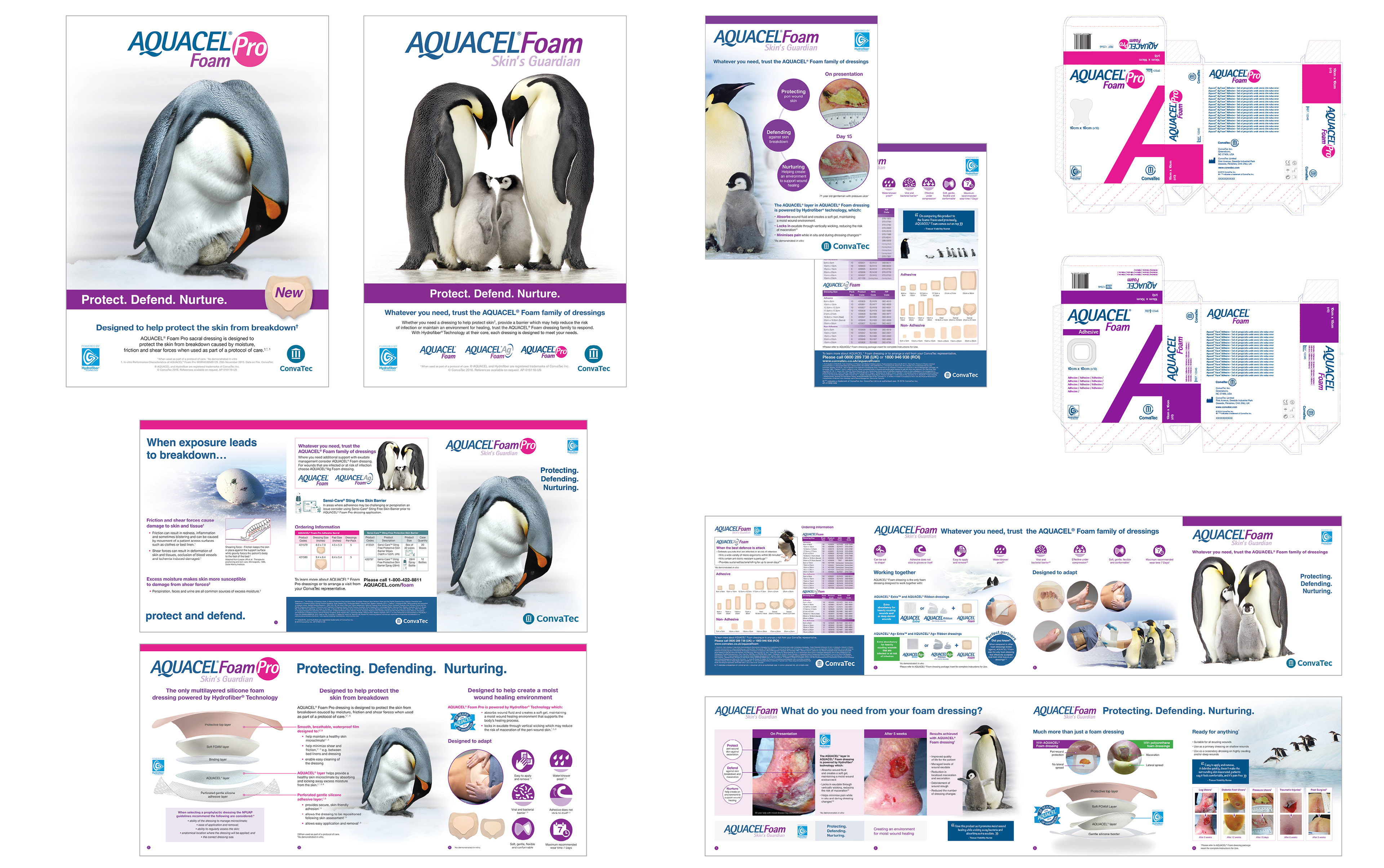
Pharmaceutical company Convatec tasked me with developing a big idea for the launch of their ‘Aquacel Foam’ range. The dressings all protect the skin, defend against infection and create the ideal healing environment.
The chosen concept ‘Protect. Defend. Nuture’ featured a range of penguins who were acting as metaphors for the benefits of the dressings. The campaign was rolled out across ads, detail aids, application guides, packaging and exhibition materials.
Pharmaceutical company, ‘ANG’ asked me to create the identity for their new device ‘Aspirate-n-go’. The new device will revolutionise nastrogastic intubation, for the purposes of feeding, teatment or diagnosis.
The rationale behind the chosen identity was one which conveyed revolutionary the four easy steps when using the device (see logo icon). The colour palette is warm and reassuring, the font family ‘Futura’ and the direction of the clean and crisp photography was designed to reflect the innovative nature of the device.
The rationale behind the chosen identity was one which conveyed revolutionary the four easy steps when using the device (see logo icon). The colour palette is warm and reassuring, the font family ‘Futura’ and the direction of the clean and crisp photography was designed to reflect the innovative nature of the device.

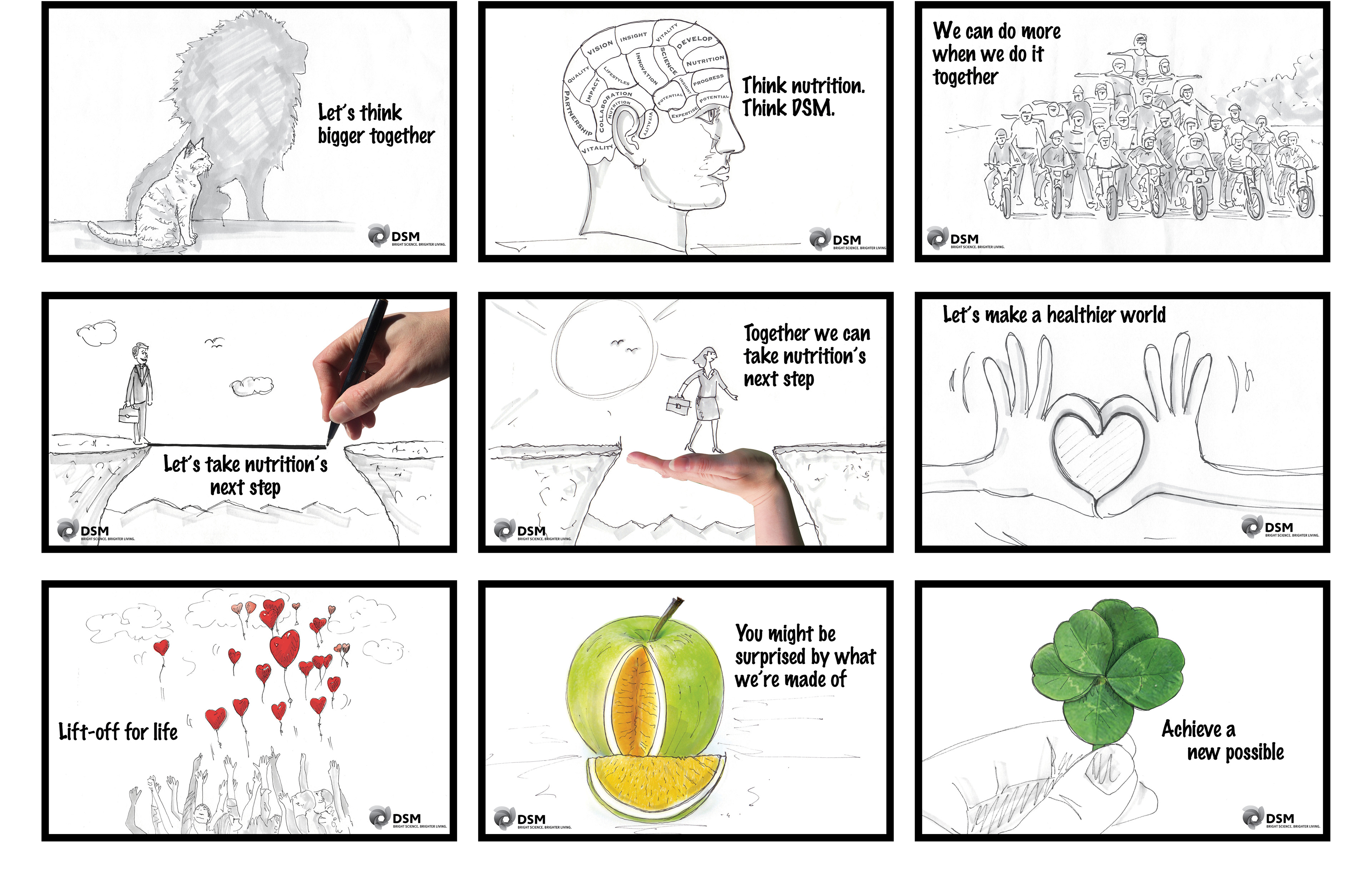
Royal DSM is a global science-based company active in health, nutrition and materials.
We were tasked in created a campaign to raise awareness of their proposition of 'working together'.
We were tasked in created a campaign to raise awareness of their proposition of 'working together'.